Saturday 30 April 2011

Kirstu - Flow Festival


Kirstu has been in charge of the promotional material for the past 4 years and come up with some great responses each year.

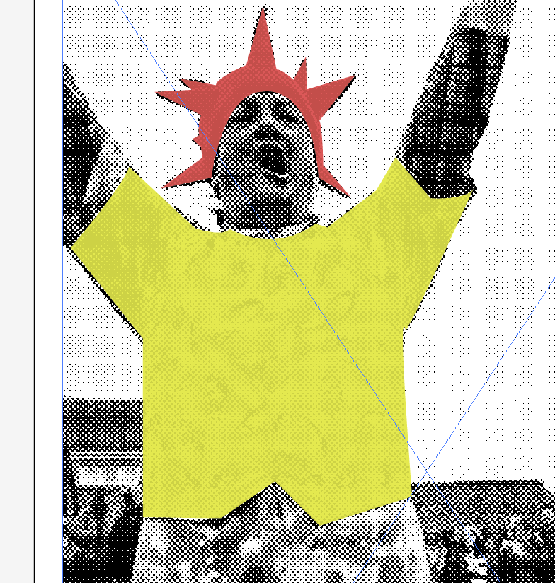
I love the mix of simple imagery and bright colours that have been layed out into shapes and scattered over a page. The concept of showing variety at the festival works really well through this visual mind map of imagery.


Great application to the environment and how the visuals can impact a viewer away from paper.


Creneau International


Packaging for speciality hot drinks by Creneau Internationa, and i just love the striped patterns on them, makes you feel like a kid in a candy shop. The packaging shows the fun and uniqueness of the product.

Banner Mock up


I took some photographs to mock up these banners in context but unfortunately they corrupted so i have used vector templates to show what they are.

This first banner is very large scale on the side of a building, this would be put up around Leeds and Yorkshire.


This street banner is a great way to advertise an event. They can be hung up down the streets of Leeds.

Friday 29 April 2011

First Tuesday Canceled

Unfortunately the First Tuesday events have now been canceled permanently due to little interest. This is a real shame as these events sounded like a great idea that students would have benefited from.

The designs created seem to have been successful but only by people that saw them and so many people weren't aware of the events evening happening.

Competition Boards


This is the board i handed in for the Leeds Loves Creativity Competition. We could only hand in 1 A3 board so it was limited in what we could propose. I have tried to propose s range of media that it can be put across and how the identity works.

Wednesday 27 April 2011

Adding Colour attempt 2


Ok so i started again, i have decided to change the greyscale halftone image to a more sepia effect, the black was to harsh and i need to consider EVERYTHING to ensure that those booklet looks as exciting as it can.

This seem to work better when i started adding colours to them and now just to add colour and shape to them all. 


adding colour


I started adding colour to the halftone images to add a fun aspect into it. Morris dancing is an incredibly colourful and decorative culture and this really needs to come through in these images. I want a really quirky style to this and not something generic and crisp so i have tried to produce these coloured shapes as if drawn by hand. I have added a slight transparency int the colour so that the detail can still be seen, however they look a bit to messy and not at all folky and quirky.

I think the colours might be to bold and even though i want bright colours to show off this magnificent culture, i still want all the details of the costumes and people. 


Halftone Images


After choosing the images that would work best i changed them all to a greyscale halftone image before adding any colour. The halftone image gives the image more of an interesting edge, and also the images do not have to be at high res as i was finding it difficult to find high res images for all the teams. But i think this is a great treatment for images that don't have to rely on the finer details.


Morris Booklet images

After seeing the project by * i have been really inspired to produce something as equally as fun and interesting. I started by emailing all the teams asking them for a statement about their team, who they are, what they do and anything else they feel is important.

I then started to gather images that i can start to manipulate, here are a few photos that i have gathered, not all as there was simply to many.


Morris Dancing Booklet

I am going to produce a small special edition booklet that will contain the morris dancing teams of straw bear. This will be designed in a vibrant and more contemporary style as i want to grab peoples attention to Morris dancing and make them realise that it is more than just old me waving hankies and sticks.

Tuesday 19 April 2011

Gareth Hardy - Logos


You know when you see a logo and its just pure simple genius and you think why didnt i think of that, well Gareth Hardy is that designer who focuses on logos that are clever and beautiful. My favourite is 'dig for St Michaels.


Mike Smith


Unfortunately i cant find anything on this guy which is a shame as i really like this piece of work and i would love to know some more context to it and see what else he does.

The white space in this design really makes the pink design stand out, its simple and bold and it works with grabbing my attention.


Cant say i'm a fan of Creamfields but i love their 2008 promo campaign that revolves around a circus theme, the idea of the circus being fun and playful and weird and a big event is something that they have tried to incorporate into their campaign, and quite successfully. If i didn't know what Creamfields was i would defiantly want to go to this.

POGO


Pogo posters, not something that i would normally look at but i'm oddly intrigued by them, the mix of colours and typefaces caught my eye and i'm still not sure if i like them. But i think they are well laid out and considered but not sure about all the different typefaces, not sure if it works all together.


Sunday 17 April 2011

Royal T


Really simple and clear visuals to representing a box of cigars for a gentleman. I really like the simplicity of this  box and the graphics used inside, it has a relaxed appeal to it yet still very noticeable for a gentleman type.

I want to make my work a bit more simple as i tend to overcrowd design and it looses impact. 


Sunday 10 April 2011

Stripe Patterns


I have been looking at striped patterns to help me develop ideas for my Morris Booklet font cover and these are some really simple but effective examples i have come across. I want something eye catching but really simple and even though some of these have a circus theme behind them i think if i can use the right colours then i can get what i need.

Brooke Reynolds

 Darden Studio

 Hello Lucky

 Katie Evans

Saturday 2 April 2011

The Logos

These have turned out really well, they are starting to work as an identity for a festival and looking like a more contemporary design for a Morris Dancing Festival.


I have tried to use three images that compliment each other and that show a different aspect to the festival as well as looking appealing and eye catching. But i think these really work the colours are bold and the images are interesting.